Why?
What is accessibility? Accessibility can mean many things. The definition is also very different when we talk about accessing the web or we talk about accessibility in the offline sense. The definition to web accessibility is that it is the level of which a webpage, email, application, presentation etc. Is available to as many people as possible.
In the past few years the word accessibility has become very popular. A lot of companies has since then started putting more and more focus on how to get their message out to as big of an audience as possible.
Together with accessibility, diversity has also started to raise its head. And put together the two areas mark a very significant subject that affect all of us.
That is why Microsoft is making sure that their technology follows a methodology called “accessibility by design”. Through this they are aiming on creating tools and methods for everyone to be able to experience web the best way possible. Using AI and advanced technologies Microsoft is aiming to make working on the web as simple and automatic as using spelling checker. In this blog post, Brad Smith (president and vice chair for Microsoft) dives deeper into their goals and ambitions for the future.
Community
Dona Sarkar is a spokesperson for accessibility, having to live it all herself daily, she is the best person to actually run and lead Microsofts accessibility division to be its best self. She is the epitome of a Power Woman 🦸♀️. She is working to make the web a more accessible place, writing books, running a fashion business and on top of that is also a motivational speaker. Amazing. The reason why I say that she is the best to run it, is because of due to dyslexia, she powers through the struggles herself. It is amazing how much she is doing and giving back to everyone. Definitely a role model.
Besides her, I see more and more people start to write about accessibility, diversity and also mental health. All important subjects that have had little to no attention in the past. But gradually both various speakers, conferences and User Groups have published great content on various tools, subjects or just speeches to make people aware of these important subjects.
Tools
When talking about tools for accessibility, then Microsoft has added an Accessibility checker to most of their products and is planning on doing it for all of them. That is also the case with Dynamics365 Marketing. Right on top of Spam Checker on Marketing Email entity you can find the Accessibility Checker tool, which you can use to make sure that your Email content is available for as many recipients as possible.
When using the Accessibility checker in D365 Marketing you have the system scan your email and all its content. If it finds something that you could improve upon, it will let you know in the side window that opens up. If it thinks that everything is fine, then it will just notify you that you are good to go 🙂
How?
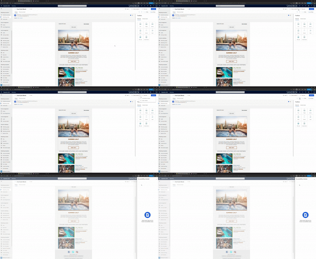
In order to find the Accessibility checker tool, you need to open a Marketing Email record.
As you can see from the illustration below that from the Marketing Email record, you have many options on the top right corner, such as Save, Check Content, Test send, Go live.
We are looking for the Check Content button. You can see that there is an downward arrow next to the name. When you click on the arrow, you see more options appear 🙂
Now you click on Accessibility checker and then the system will start checking your email. Once it is done and ready with a result, it will show it in a new pop-up window that opens up on the right side of the screen.

If you have some things that the system believes can be done better, then you will see suggestions as pictured below:

In this example the system found 4 things to correct. It found 2 issues with buttons and 2 issues with Images in the email. Lets dive deeper into them.
Buttons
When clicking on the button error, then it opens up more information about what it believes could be done better. In this example it believes that there is insufficient color contrast between the font color and the background color.
It actually gives you the possibility to change the colors already within the tool. So you don’t have to close it, go find the button, open the toolbox and change it there. That is a great feature that saves clicks and time for users.
Besides that, it also highlights the area in the email, that it thinks has an issue. In the picture below you can see that the “read more ->” line has been marked.
When you have made the changes, then in the bottom, there is a “Check it again” button. When clicking it, the Accessibility checker tool will check the email again to see if the changes are sufficient.

Images
The same process as with buttons can be seen for the error about Images. Here, the system found out that I had forgotten to add Alt text to the images. Once again, I can just add the Alt text in the window here and click on the button to check the email again.
And again, the picture that is missing the Alt text, is marked with a blue rectangle.

This process you can run again and again until there isn’t anything more to fix. Once the system thinks the email is good and accessible to as many recipients as possible, it will congratulate you on the process and lets you know that everything looks great 🙂
More Information
- Power Platform Virtual Happy Hour – Accessibility episode
- MS Documentation about the tool – Check the accessibility of your email messages (Dynamics 365 Marketing) | Microsoft Docs


